A focused practice built around identity, art direction, and the systems that hold them together.
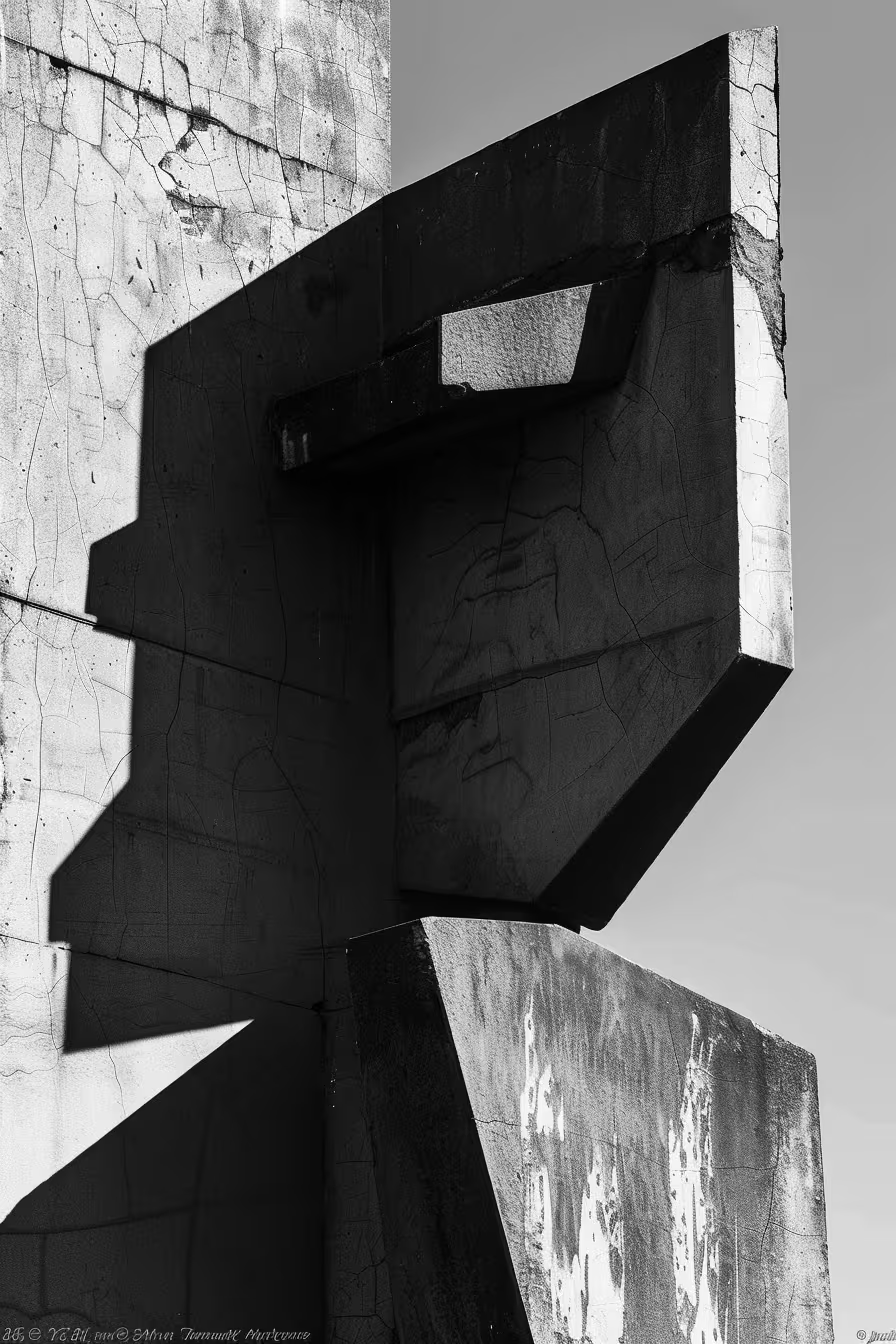
A focused practice built around identity, art direction, and the systems that hold them together.
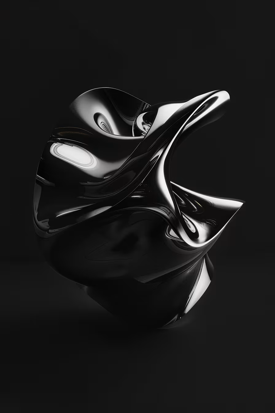
At SIGNAL, systems aren’t frameworks for design teams — they’re how brands stay consistent in the real world.
Identity, art direction, editorial, digital. We treat these not as distinct offerings but as different expressions of the same thinking — built together, held together.
Built to scale
Each service represents a layer of a single system — designed to connect, scale, and hold together over time.
The foundation everything builds from
We help brands clarify who they are, who they’re for, and how they should behave — before any visual or digital decisions are made. The goal isn’t to sound clever, but to create a framework that guides design.
Seen before it's understood
We develop the visual concepts, references, and frameworks that determine how a brand is seen and felt across every context — from campaign to product, editorial to environment.
Where object meets message.
Every decision — paper, weight, binding, grid — carries meaning that digital cannot replicate. We design editorial work that treats the physical object as seriously as the content it carries.
Identity built for the screen
We design websites and interfaces that carry the same visual logic as everything else — natural extensions of the identity, never adapted versions of it, built for the screen.
Working with OBSCURA felt considered from the start. They understood the architectural logic behind the project and translated it into something visually coherent without overcomplicating it. The identity holds up across every context we've put it in.

OBSCURA grasped what Modular was about before we could fully articulate it ourselves. The identity they built has the same quality as the studio it represents — fluid on the surface, structured underneath.

We needed something that felt like the music without illustrating it. OBSCURA understood that instinctively — the result is an identity that leaves enough space for the work to breathe.

The best gallery identity is one nobody notices. OBSCURA built exactly that — a system present enough to be coherent, restrained enough to disappear when the work demands it.
.avif)
The new identity gave us confidence we didn't know we were missing. Every issue since has felt more deliberate, more considered, more ours.